brewbuds design
Every cup, place, and reaction in the app is drawn by hand on the same 48-unit grid. This page is the grid.
palette
core
the core brand palette used for type, borders, dividers, surfaces, and states. this is what the mobile app code and web reach for, and it is the only palette allowed to move if the ui is ever rethemed.
illustration
colours baked directly into the svg artwork. on dark surfaces, artwork sits on a fixed milk panel rather than being inverted. places share one red separated by lightness — the value each place gets is set by how much outline its artwork carries; silhouette carries the category.
citrus is the core brand orange. it appears on the logo and the reactions, and nowhere else. milk, dark roast, and citrus appear in both palettes. same colour doing different jobs.
temperature
hot and cold are semantic ui tokens, not artwork constants. temperature badges always sit beside a brew illustration.
component
functional colour the apps reach for by role, secondary to the brand palette. the neutral ramp is darkroast flattened over milk at 5, 10, and 15 percent (citrus tint is the same move with citrus). shadow and white exist so no component ships a raw hex.
tokens
spacing
six values, no in-betweens. each pair of tiles above is separated by the literal token, what you see is the actual gap the apps use.
radius
sharp edges are the default language (cards, sheets, tiles sit at none); sm and md soften interactive chrome; pill is reserved for counts, badges, and toggles.
type
every variant carries fontSize and lineHeight together. skeletons size to the lineHeight, never the fontSize, so loading bones can't shift real text. the bar below body's specimen is a skeleton at exactly its lineHeight:
weights
icons
ui icons are lucide with 2px stroke and 24 to 28px in place.
three things are never library icons: the apple and google logos (brand marks), the capture “+” in the tab bar, and finally the illustrations.
the grid
the baseline case, the cup stands at y=42.
every icon is drawn on a 48-unit canvas with a 40-unit live area and four units of margin on every side. nothing draws outside it.
grounded icons (cups, buildings, etc) stand on a baseline at y=42. reactions are the exception; they float centred on the canvas.
size means importance. an espresso is not drawn smaller than a latte. proportion and detail carry the difference, not scale.
beverages
hover or tap a card for the three sizes the app actually renders: list, picker, detail.
 americanolistpickerdetail
 cappuccinolistpickerdetail
 chailistpickerdetail
 coffeelistpickerdetail
 cortadolistpickerdetail
 dirty chailistpickerdetail
 espressolistpickerdetail
 flat whitelistpickerdetail
 french presslistpickerdetail
 lattelistpickerdetail
 london foglistpickerdetail
 macchiatolistpickerdetail
 matcha lattelistpickerdetail
 pour overlistpickerdetail
 tealistpickerdetail
 yerba matelistpickerdetail
locations
 home
home work
work cafe
cafe buds
budscolour here is a ladder plus one outlier. the three reds aren't category-coding: the office block's nine window frames put more dark outline against its fill than the house or the storefront do, so work takes the lightest value and home, mostly open roof, takes the darkest. buds steps off the ladder into honey — home, work and cafe are your places, buds is other people's, and the semantic odd-one-out gets the visual odd-one-out.
reactions
reactions float. they're the only illustrations that keep citrus. the brand orange they share with the logo.
rules of the set
one grid.
48 canvas, 40 live, nothing outside it.
one baseline.
grounded things stand at y=42; floating things center.
size is importance, not physics.
an espresso is not drawn smaller than a latte. proportion and detail carry the difference, not scale.
nine colours.
no additions without a palette review.
one mark per drink.
every beverage gets one distinguishing mark, never two.
logo & wordmark
the mark
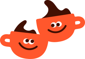 60px = 0.5 × 120px
clear space is half the mark's height. it is never baked into the file. the file is edge-to-edge, the space belongs to whoever places it.
the lockup
the wordmark is live text. Inter Bold, lowercase, darkroast. the mark is 1.35 × the ascender tall, sits 0.55 × the ascender away, and centres on the optical middle of the x-height rather than the bounding box, so the b/d ascenders don't drag it upward.
two marks, two jobs
full mark · 1.43:1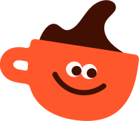 small mark · 1.15:1
the full mark is 1.43:1 and needs width. below 24px it loses its eyes, so small surfaces get the single-mug mark at 1.15:1. one cup, complete liquid, handle mirrored to the left so the mug faces into the frame.
at real size
 96px
96px 48px
48px 32px
32px 16px96px · 1×48px · 2×32px · 3×16px · 6×
rounded corners are baked in at 24% radius, browsers do not mask favicons the way app platforms do. the top row is each file at its true pixel size, so what you see is what survives; on a retina screen those get smoothed, because a 96px file has no second pixel to give. the bottom row is the same files at whole-number zoom with smoothing off and every block is one real pixel.
the app icon
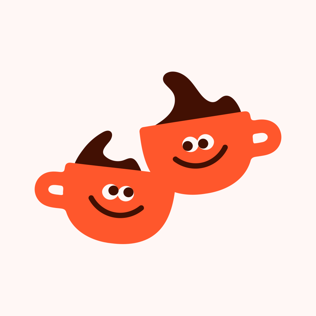 iOS squircleAndroid circleAndroid rounded square
the icon is opaque. iOS rejects transparency, and a milk field is what makes the mugs read at 60px on a home screen. one image, three platform masks.
the logo uses citrus #ff572c, the same orange as the reactions. it previously used #ff663f, 24 RGB units away, close enough to read as a mistake rather than a choice.